The Latest U.S. Inflation in a Few Charts
The latest U.S. inflation numbers came out this week and they weren’t good. Annual inflation rose from 3.1% in January to 3.2% in February, and the Fed’s preferred measure of inflation (excluding food and energy) rose even more, hitting 3.8%.
This tells us that inflation is likely here to stay for a bit longer than originally anticipated. That, in turn, tells us that higher Fed interest rates are likely to remain in effect for longer which also implies that the likelihood of a rate cut in the coming months is lower. Sure enough, 10-year US Treasury rate ticked up from 4.15% to 4.18% following the news. (Update: Today, March 14th, the producer price index, PPI, numbers also came out higher than expected and those Treasury rates ticked up further.)
We need more time to understand why inflation isn’t falling more and why it rose now. Off the cuff, I’d suggest that all the current and planned higher government spending combined with ballooning government deficits isn’t helping. But that’s a longer-term trend, not something affecting month to month. That’s a discussion for another time.
For today, I just want to take a quick look at the numbers. The BLS has a great site for the CPI numbers, and I pulled all the following charts straight from there (link in footnote[1]).
Let’s start by putting current inflation into perspective.
A Longer Perspective on Inflation
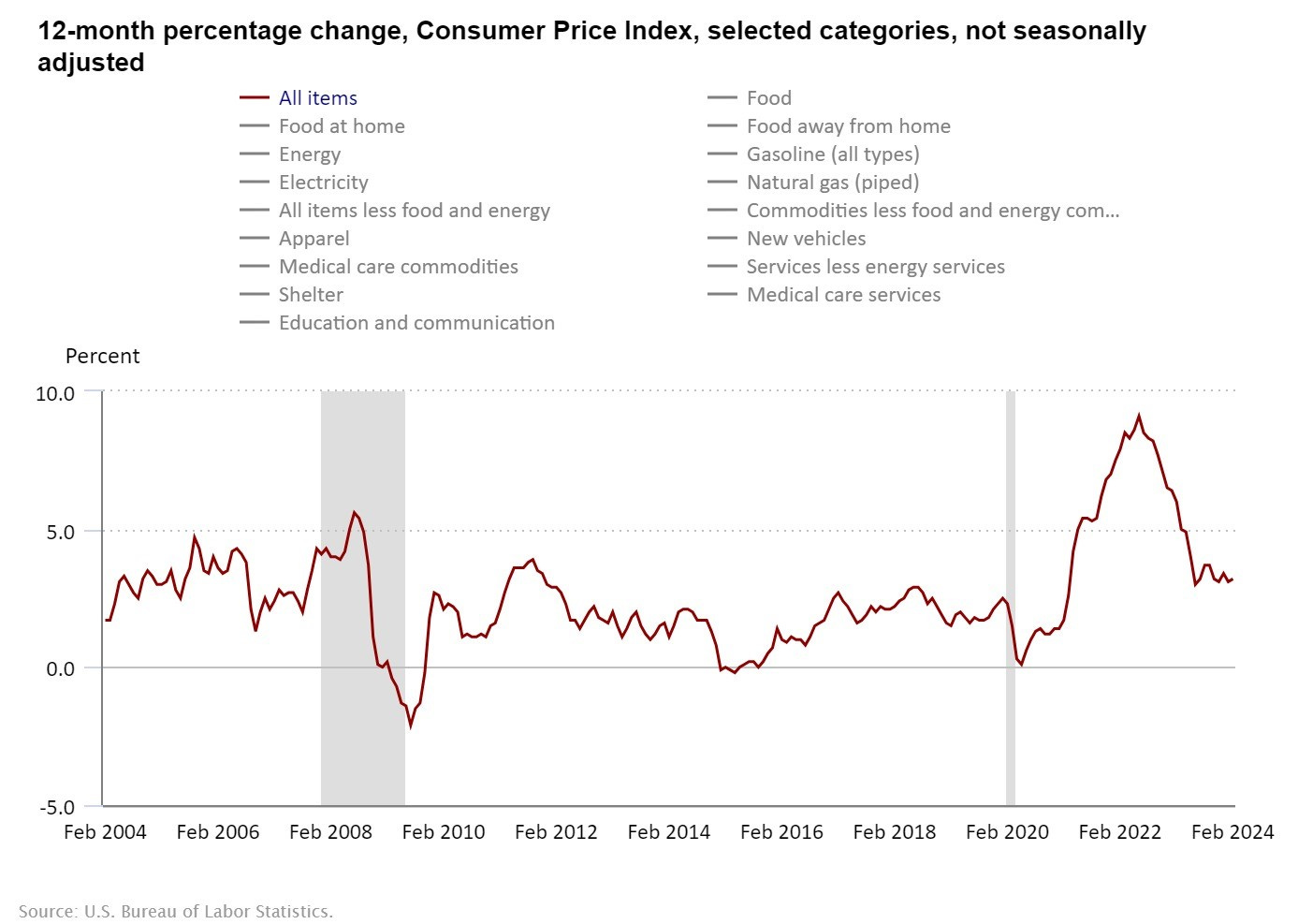
The first graph shows inflation back to 2004. Rather than using this to remind us that we are better off than we were, say, 2-3 years ago, what I’d like to emphasize here is the end of the graph.
The rapid decline in inflation seems to have stopped and hit a new, stable level. Looking at the whole graph, you can see periods where inflation seemed to settle for a while. The graph starts (2004-2005) with it relatively stable, then it rises a bit for about a year, then settles lower around 2007, then we hit the recession (big grey bar). We continue from there and inflation settles again in the 2012-2015 period for a while. The 2015-2016 period looks a little different, but, excluding that, the 2012-2020 period looks like a relatively stable period with inflation in the 1-2% range.
Today it looks like we are settling on another stable inflation period, at least so far. That looks like a 3-4% inflation level. That’s not at all what the Fed targets. The Fed targets 2%, especially for core inflation which is higher today than the above graph shows. If inflation is indeed settling at a new level, then it’s wrong to say it’s just slowly adjusting. No. It stopped adjusting. If it stays here, it will be higher, persistent inflation, and the Fed will have to act to bring it down.
Headline vs. “Core” Inflation
Our next question is why “core” inflation (green bar) – which excludes energy and food – rose more than the headline (red bar). That is answered immediately in this second chart: energy prices declined by 1.9%, and food prices rose by 2.2%. Clearly, the CPI weighs energy more than food, and the 1.9% drop in energy prices pulled down the overall average.
But, looking behind that number is also interesting. The next chart clearly shows that the real driver is an overall decline in the prices of “Energy Commodities” (-4.2%), which includes fuel oil and gasoline prices. Not to overwhelm you with graphs, I just share their numbers here. Fuel oil prices fell by 5.4%, and gasoline prices fell by 3.9%.
The small increase in “Energy Services” (+0.5%) is a bit misleading in my opinion. Digging behind the numbers reveals an 8.8% decline in natural gas (piped) prices and that overwhelms - essentially hiding - a 3.6% increase in electricity prices. The fact that the average of -8.8% and +3.6% as +0.5% tells us they also weigh electricity more. And, with all the pressure on the electricity from EVs plus an old U.S. infrastructure suggests that we’ll continue to see higher electricity prices regardless of Fed policy.
Chicken
The next chart is a fun one. If you have a minute go to BLS and click the different prices (link in footnote[2]). Everyone in the U.S. has been feeling the chicken and egg price increase. So, I thought I’d share it. It stands out in the numbers too. The dark line is eggs and the yellow line is chicken overall.
We all felt the spike in egg prices, but the clear trend for both of these is that chicken related prices continue to rise. No deeper point here. It’s just sometimes nice to know we aren’t going crazy. Yes, we felt it, and, yes, chicken prices are unusually high.
Continued Return Post Covid?
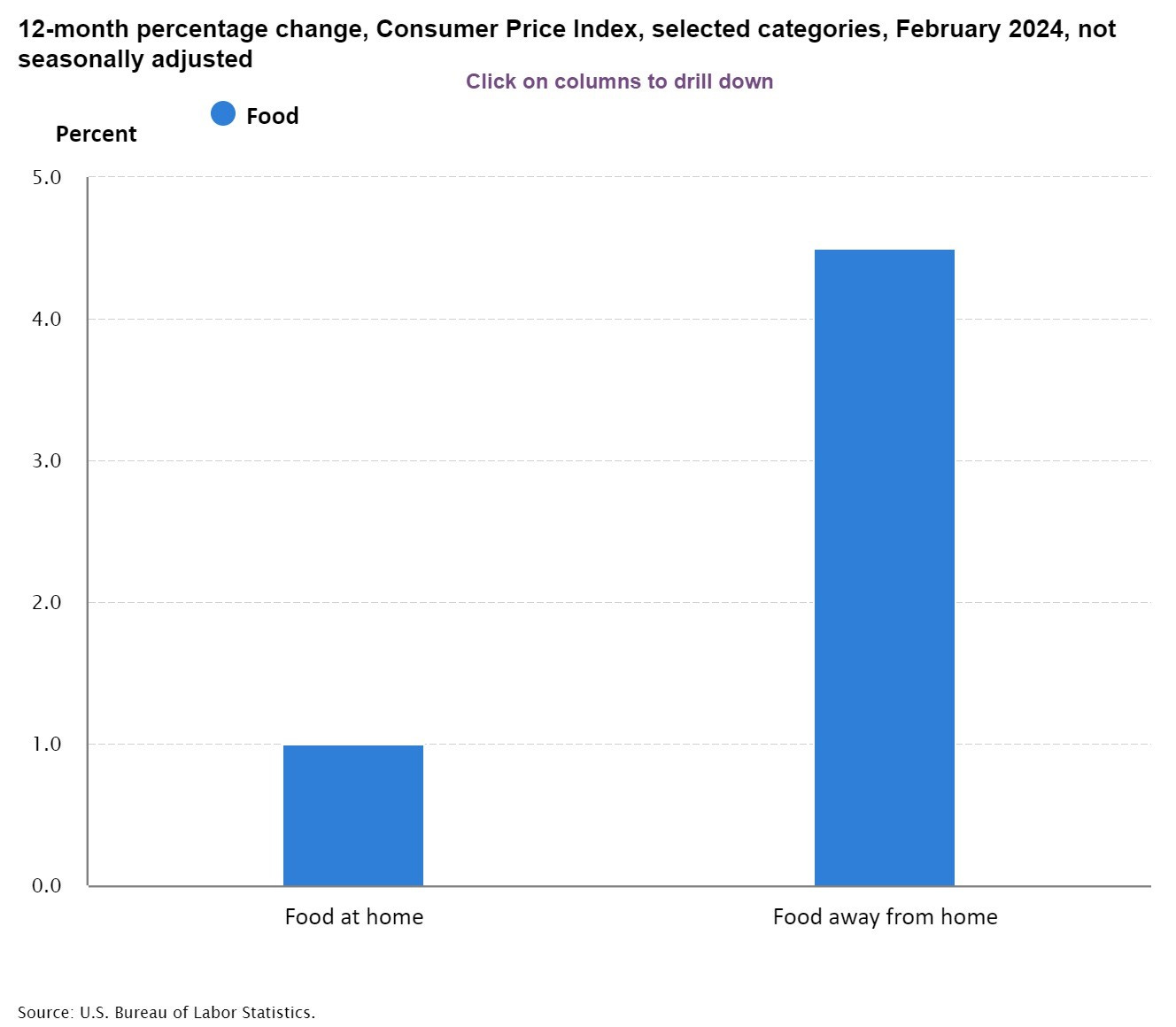
This last chart makes me wonder if we are still seeing higher prices due to a return to a post-Covid life.
As demand grows, prices rise. If you add to that some supply shortages, then prices will rise more rapidly. When Covid hit, everyone in the world rapidly tried to shift their spending to “home” goods: appliances, electronics, wood, materials for renovations, and so on. Shifting everything overnight caused bottlenecks in supplies, and that was on top of other supply chain bottle necks due to other problems with shipping, ports, and so on.
But, that Covid shift was a relative price shift. That is, those “home goods” prices spiked up but “away from home” prices fell.
In theory, however, we can imagine a shift in demand like this just causing a drop in some prices and a rise in others, leaving the overall CPI unchanged. That it didn’t reflects real world frictions. In particular the price decline was soon mitigated by a rapid decrease in supply as restaurants, hotels, and other such services reduced hours, closed and began running into their own labor supply problems. Add to that a lot of stimulus to support demand, and we saw higher prices everywhere.
Moving past Covid to today, we see all food prices rising but we definitely see “away from home” prices spiking much more, by 4.5% in this graph. That suggests to me that it is part of the unwinding from Covid as our distribution of demand gets rebalanced. We want to eat out more, and it’ll take time for the economic system to re-adjust everything to that. In the meantime we’ll see higher prices. And, that high-price effect will be worsened if government spending or monetary policy further stimulate demand. The effect will be lessened if not, and will also go away on its own as the supply-side of the economy adjusts.
Conclusions
If the higher food prices are post-Covid rebalancing, then we’ll see them decline on their own. No need for special Fed action.
If the electricity prices continue to rise as we add more and more burdens to a fixed, old energy grid in the United States, then no Fed action will stop it.
I think it’s worth watching global oil markets since the Biden Administration has pushed U.S. oil sales to keep prices down, and other OPEC members have taken some actions to offset that. Who wins will be important for CPI numbers. But during an election year in the U.S. my bet is on government trying to keep downward pressure on gasoline prices which are seen as something voters watch.
If I were Fed chair – and I thank God that I am not! – then I too would watch and wait for now. This latest data doesn’t suggest that any real change in policy is needed yet. I would watch government spending for overall added pressure, and otherwise hope the Covid rebalancing runs its course sooner rather than later. Other than that, hold steady for now and pray for the best.
[2] https://www.bls.gov/charts/consumer-price-index/consumer-price-index-average-price-data.htm


